Notes from the (Re)Design Studio: Introducing Our New Look
6 Minutes Read Time
5 minutes read time
We recently received an email informing us that poets were eagerly awaiting our web redesign, which, admittedly, has taken a long time to come to fruition. None of that time was spent idly, however—like a swan gliding on serene waters, we’ve been paddling like heck underneath with wireframing, prototyping, developing new brand standards, and more. We hope that prose writers also eagerly await this change, as it’ll have a huge (positive!) impact on the way our readers experience the journal and the way our contributors’ work is featured.
We’re happy to inform the poets (and the prose writers) that we recently reached a milestone: I handed our web design prototypes over to our fantastic developer, Josh McCall, who will bring them to life in code. At last, it’s time to walk you through a little of what went into our web design, and give you a sneak preview!
Palettes for Our City, Lions for Our Mascots
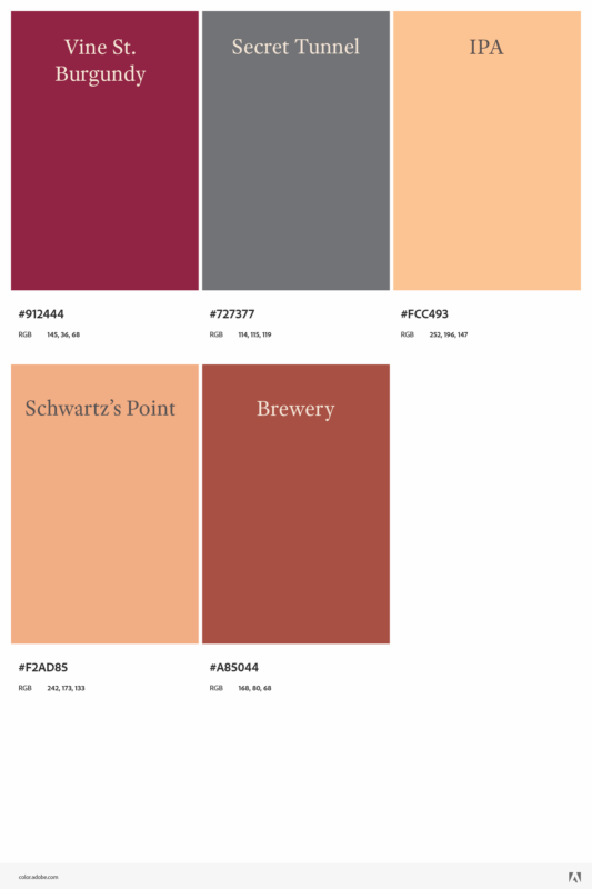
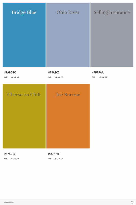
You may have noticed that our main color palette has for a long time heavily featured black and red, the colors of the University of Cincinnati Bearcats (go Bearcats!), with a small palette of accent colors and one of neutrals. Though these colors embody school spirit, they don’t allow us much design flexibility to match the array of cover art and images we use online. In redesigning our look, I toned our main colors down into a more bookish russet, charcoal, and cream, and set out to create an accent color scheme that more accurately embodies CR’s literary presence not just at University of Cincinnati, but within the city of Cincinnati itself. This involved making a number of palettes we can choose from as we switch out the cover we feature on the site.
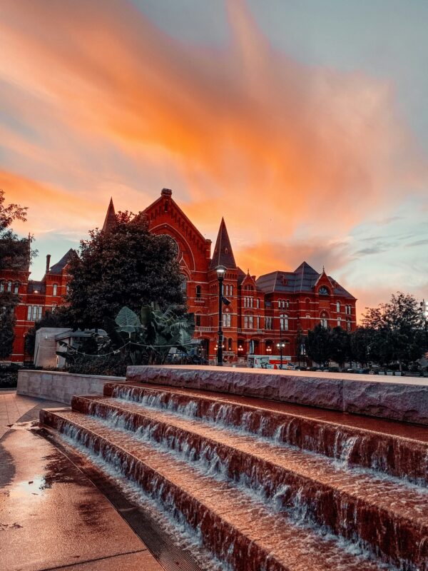
Cincinnati is one of the oldest cities in the Midwest, home to the largest intact historical district in the country. Our neighborhoods feature stunning examples of Italianate architecture, colorful murals, gas lighting dating back to the 1850s, and thickly wooded Appalachian hollers shading little family farms that still keep goats and horses. Whenever I explore the city I’m struck by how closely its colors resemble old, leather-bound books in a historic library. Using snapshots of various neighborhoods around the city, I created a series of color palettes that will be used across the site and our social media (N.B. because of copyright concerns, several of these photos are only examples of the neighborhoods related to the palettes, not the photos on which these palettes were originally based):
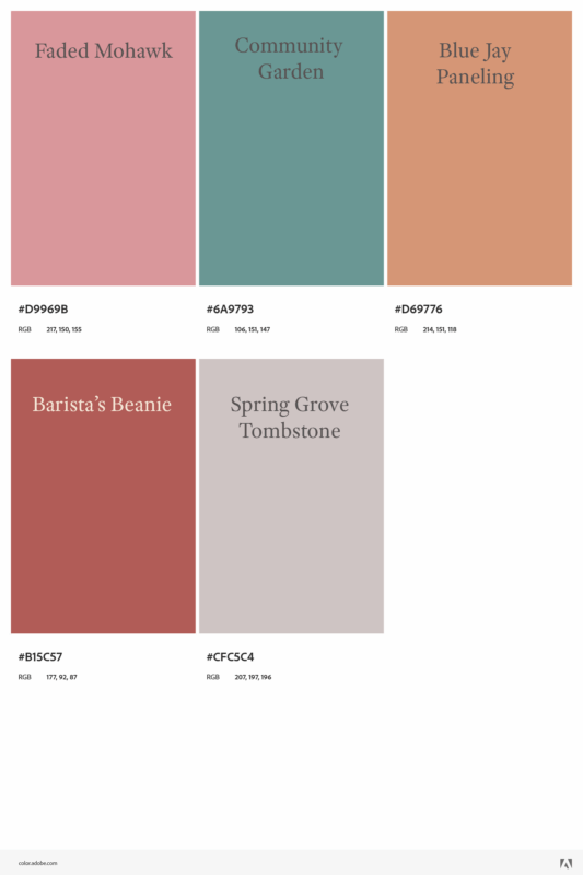
Over-the-Rhine
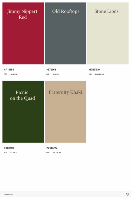
Northside

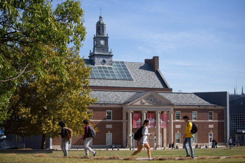
University of Cincinnati Campus/Clifton
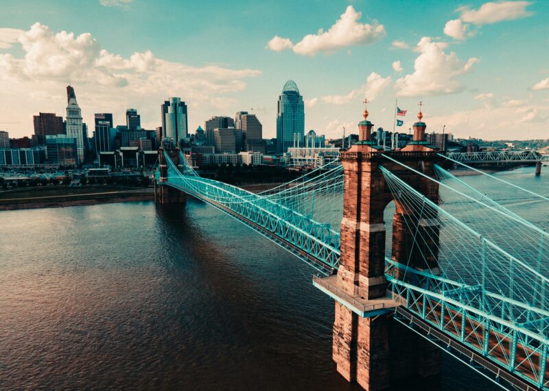
Cincinnati Skyline
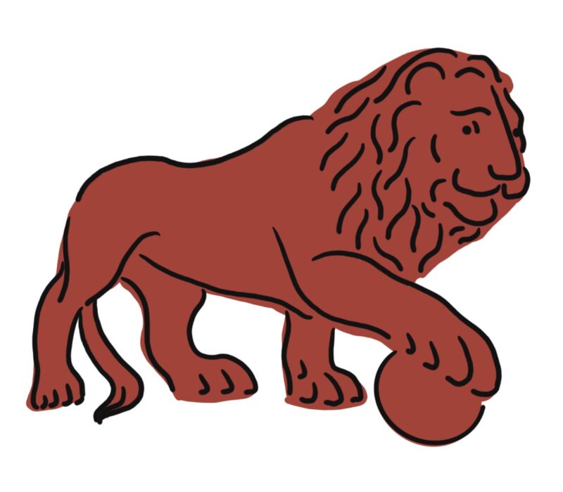
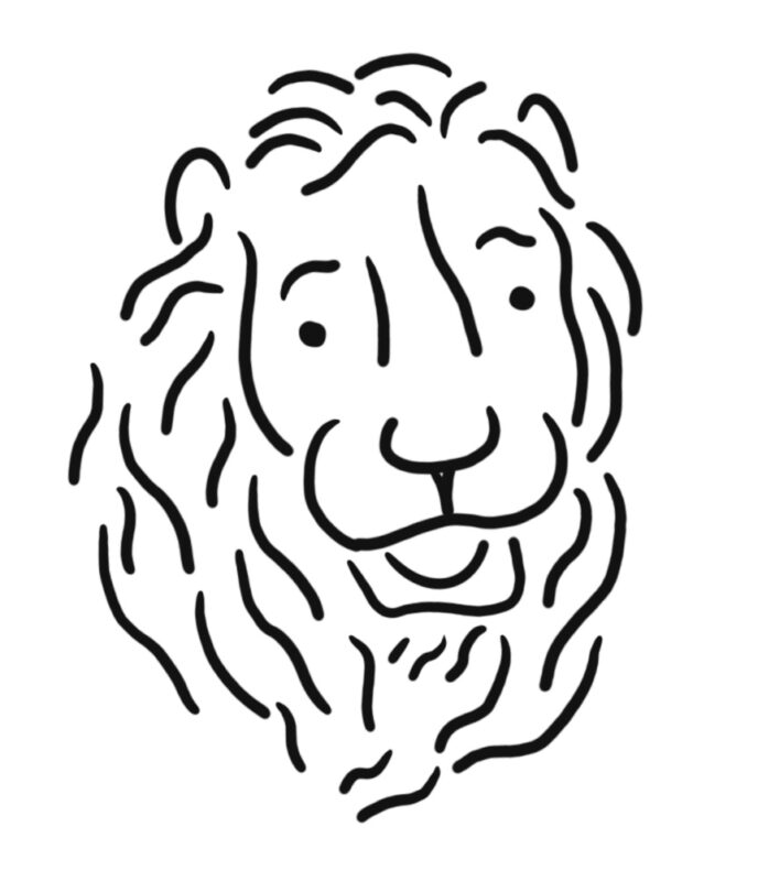
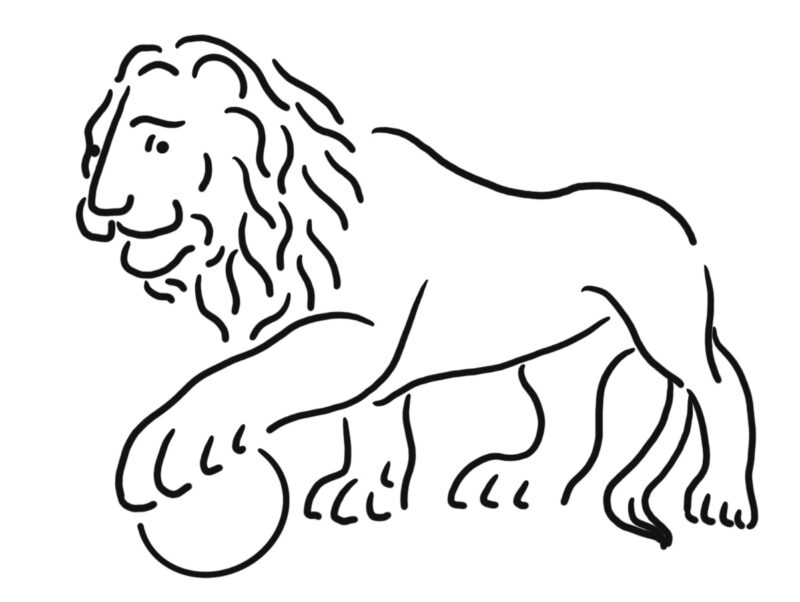
We also realized that, though we’ve got a memorable logo and wordmark, CR’s web presence was lacking imagery that defined us. We wanted a classy and iconic image or figure that embodied the spirit of the journal and helped create definition between our biannual publication and our weekly, web-only miCRo series. Little did we know the answer had been guarding our front door for 120 years.
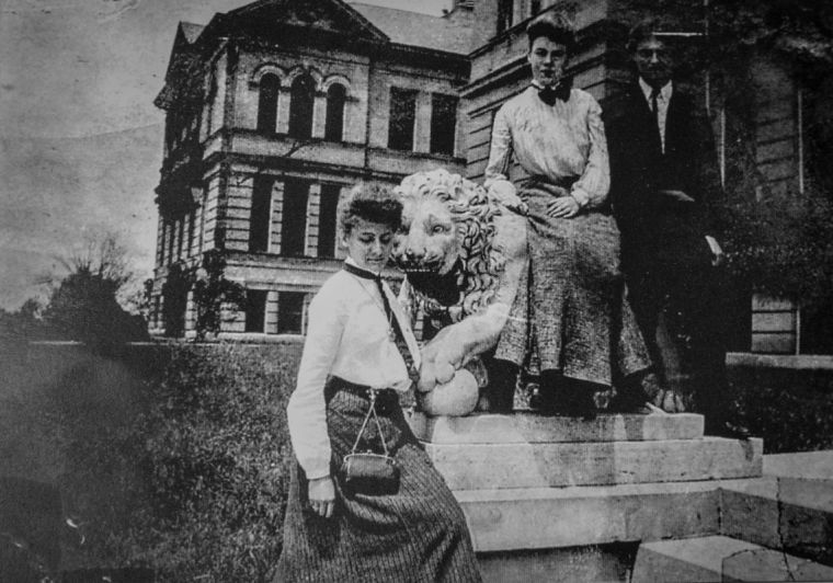
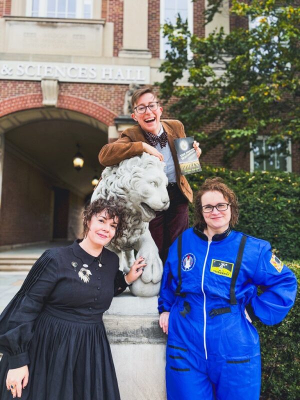
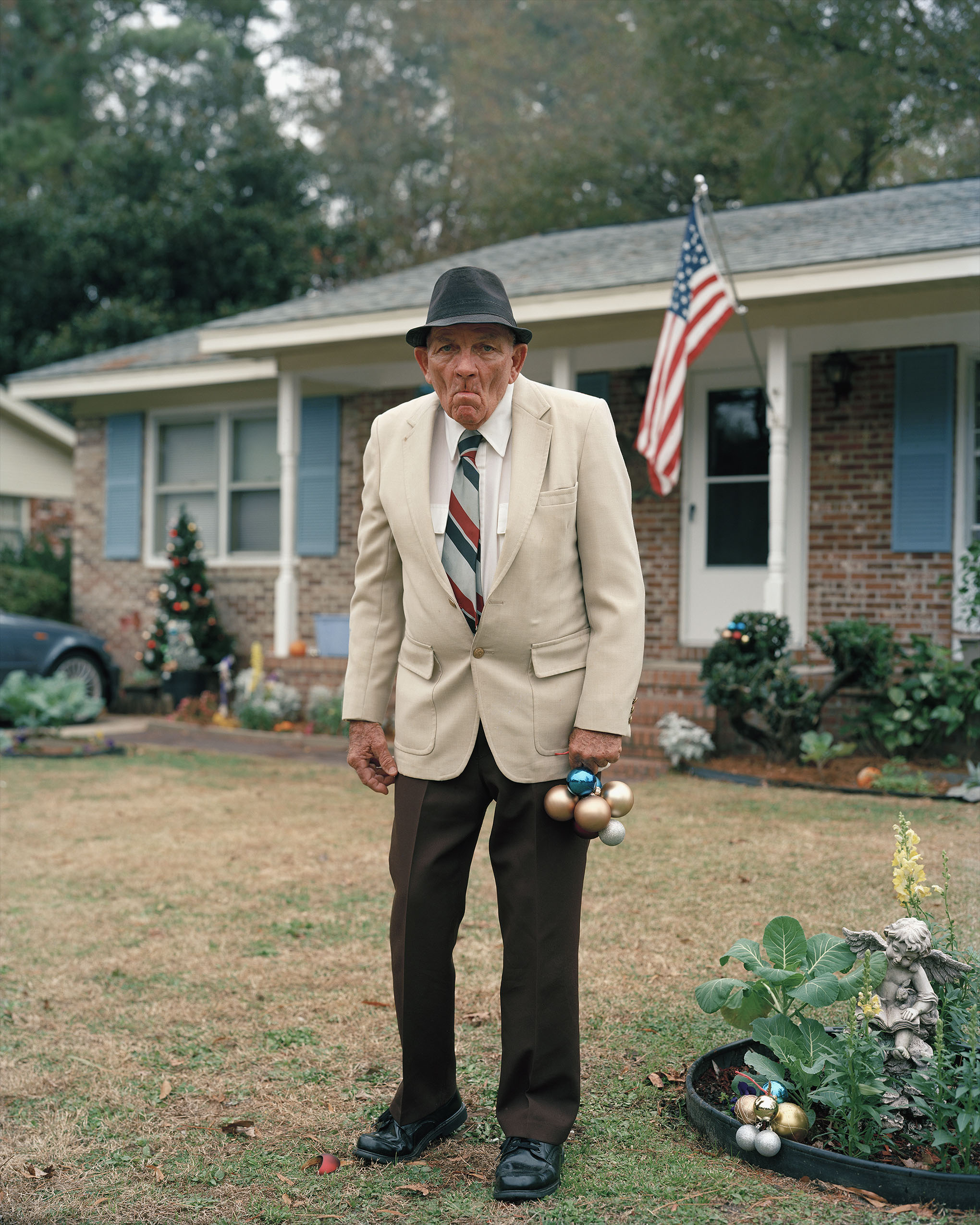
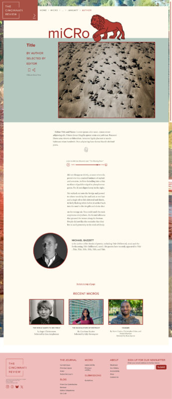
The New York Public Library has its lions, Patience and Fortitude, and The Cincinnati Review has our lions, Mick and Mack, copies of Florence’s Medici Lions who guard the entrance to Arts & Sciences Hall where our office is housed. The NYPL lions are stoic and dignified; Mick and Mack are a little goofy, often have lipstick marks on their muzzles, and have human teeth, just like our editors and many of our readers. We commissioned the fabulous Maggie Stockman, illustrator and tattoo artist, to create drawings of our beloved leonine guardians to work as both large mascots and smaller section breaks and marks. You’ll see them used throughout the new site:
Readability, Accessibility, and a Web of Pages
Besides colors and imagery, our goal in the redesign was to make the online reading experience as comfortable and aesthetically pleasing as holding the physical journal. This is particularly important because we’re launching a fully online subscription model that allows readers to sign in and read whole issues.
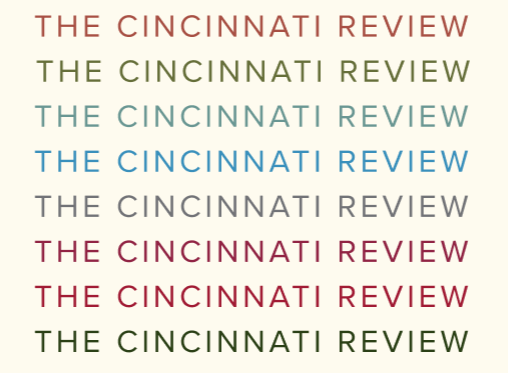
This involved matching our online fonts to the fonts you’re used to seeing in our printed pages, and making sure that the typesetting was optimized for readability even on the smallest of screens. There are so many decisions and calculations that go into typesetting that it deserves its own post, but suffice it to say that both font size and line spacing as well as color contrast were key here.
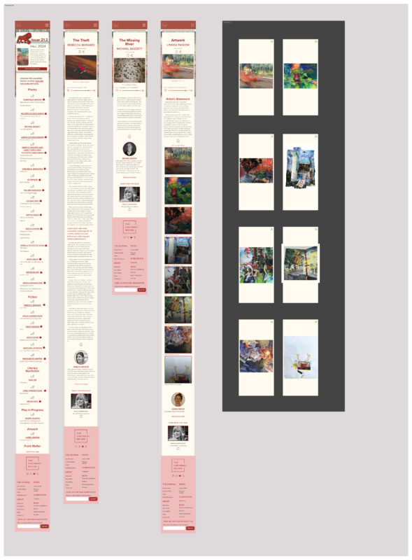
I used a design tool called Figma to standardize our type, create layouts for several break points (ie. screen sizes), design dynamic elements like menus, and link pages to each other to form a basic map of the website. The result is a huge web of pages in several aspect ratios, that look this when you zoom out:
After these frames were designed and linked together to create a functional prototype, I passed them on to Thalia Kapica, a web accessibility specialist at the University of Chicago, to look them over and suggest changes before they went into development. Thalia will later look at our code to make sure it, too, meets WCAG AA standards.
And then it was off to Josh, who receives a “dev seat” to pull the CSS out of this Figma file and onto WordPress. Inevitably he’ll add his own touches, as well—especially to the feel of our back end, which needs to be usable, virtually unbreakable, and code-free for our many student editors.
I’ve loved designing this new home for a journal, editors, and readers I care so much about. We can’t wait to launch this site, and hope you can’t wait to visit it.