In Praise of the Flush-and-Hang
7 Minutes Read Time
Managing Editor Lisa Ampleman: I write in praise of the hanging indent, also called the flush-and-hang, a typesetter’s tool to let the reader know that the line is longer than the page itself, that there hasn’t been a purposeful line break by the poet. This might be an Unpopular Opinion today and even make me seem like an old fogey (good grief, just saying “old fogey” tags me as such, perhaps), but as a reader and editor, I appreciate a long-lined poem that can fit on a standard page.
The Chicago Manual of Style, our choice for house style, defines a hanging indent as one “in which every line but the first is indented from the left margin, [which] is used for the items in a list, including a bibliography or reference list or an index.” Picture the papers you’ve written in MLA, APA, or Chicago style: in each case, the bibliography or works cited consists of entries that start at the margin for the first line but are indented thereafter. In a sense, each bibliographic entry is one long “line,” broken only by the limits of the page.
How a Hanging Indent Works in Poems
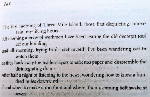
Here’s a picture of C. K. Williams’s poem “Tar” (first published in his 1983 book of the same name and then later in his Collected Poems, which I used for this photo). This might look like a twelve-line poem, but it’s actually just six lines, with a hanging indent.
I don’t write in long lines myself, but I studied Williams and other long-lined poets as part of my MFA exam studies back in the early ’00s. According to my notes,
Some long-line poems hearken back to the rhythms and language of the Old Testament. Others use the unit of sense (or sentence) as the measure of a line, rather than syllables or stresses. According to C. K. Williams, he began to use the long line to accommodate the subject matter that prose, especially journalistic prose, can accommodate. And poems with long lines often make use of the elements of prose, such as repetition and syntax.
“What kind of syntax?” someone now double the age of that writer wants to ask her (all prose has syntax). But more importantly, that kind of analysis about the poetics of long lines would need to be expanded these days, when poets are using the field of the page as a tool of structure. I’d add now that the method of composition is part of the equation too.
The Material Realities
For example, poets using Microsoft Word, Apple’s Pages, or Google Docs often use the default 8.5 x 11 page as their canvas. Each generation reads a little more of their content online than the one before—so the printed page, although it might remain a primary method of reading overall, means less, perhaps, to the composer. Some poets are also using InDesign to create visual poetry or doing erasures whose size might be determined by the original document being erased. Overall, the material reality of writing has led to more poems that don’t easily use a hanging indent.
As an editor, I find myself agreeing with Sarabande Books’s Executive Editor Kristen Renee Miller, who in a Poets & Writers piece recommends thinking about the realities of publishing when you format your poems. I’ll quote her at length:
We receive so much beautiful poetry, meticulously arranged to look a certain way on a standard page of 8 1/2 x 11 inches, which does not easily translate to the requirements of print publishing. There are only so many ways to accommodate these works, most of them unacceptable either from an aesthetic standpoint—nobody wants their typeface shrunk to 8 points; nobody wants a floppy, composition-notebook-sized collection of poems—or from a budgeting standpoint: Fold-out pages are wildly expensive. [. . .] It’s exciting to field work from writers who have grown up with these tools and platforms, whose sense of capital-P poetry has developed with this sense of limitlessness all along. But poets, with love, if you’re imagining your work living in a printed book, you must consider how to make your vision take shape on a more pocket-sized surface area.
Miller’s reference to fold-out pages reminds me of the first times I saw a publication handle long lines in a way that diverged from the hanging indent: Jorie Graham’s foldout pages in Poetry magazine especially (which had the money), so that her lines and the poem itself were reproduced as closely to her vision as possible.
How Publishers Make It Work
At Acre Books, where I’m poetry series editor, we were able to change the trim size of Matthew Minicucci’s Dual so that his contrapuntals had the space they needed to breathe (not quite to the floppy notebook size Miller mentioned). But we don’t have that option at The Cincinnati Review: our trim size is 9 x 6 inches, and we’re unlikely to change that anytime soon. Some print mags do have more square-like pages, but we estimate that we can include only about sixty-four characters (including spaces) in any line on our page.
When the CR has a poet who uses white space within lines as well as long lines, we don’t use a fold-out page, but we can turn the poem broadside (words running vertically up the page instead of horizontally). Take a look at Milla van der Have’s fantastic poem “full disclosure / an inappropriate questionnaire *” that uses a question-and-answer format in which each stanza is aligned differently on the page. And Preeti Parikh’s poems in our fall issue, 20.2, employ white space within lines (and between lines) in such a way that a hanging indent would look like a mistake.
That’s one solution, but because I grew up reading print in one direction, long before e-readers or tablets, my brain doesn’t always take in poems printed broadside as well. I’m not sure of the exact cognitive glitch, but I don’t read them the same way. Thus, my support of the hanging indent!
A Craft Suggestion for Long-Lined Poems
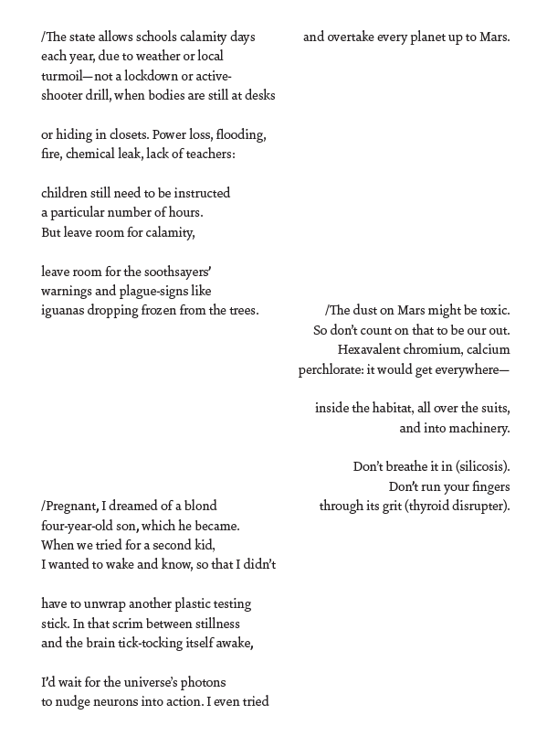
If you want to avoid a hanging indent or a poem set broadside, one option is to make your field of composition match the publication you’d like the poem to appear in. When I was writing a long poem, “Calamity Days,” I knew that if it ended up in a book, it would need to fit without a flush-and-hang. Though the lines themselves weren’t long, the poem consisted of two columns, each a different span of time.
So, I set the margins in my document to be 9 x 6, and I made sure the font wasn’t incredibly small. Those changes helped me figure out where to break lines to avoid a hanging indent.
Of course, you should ignore me and make what you need to make! You can always revise afterward to fit the material demands of publishing. Another option: keep the poem in its original form and make your own zine of whatever trim size you want, rather than molding it to the shape of another publication’s.
I suspect there are strong opinions out there about typesetting poems in today’s technological options. I’d love to see more of a conversation about the challenges and opportunities!