Some Survey Results
4 Minutes Read Time
Managing Editor Lisa Ampleman: We are extremely grateful to all of you who took part in our survey earlier this month—we had more responses than we expected, and we got some useful information as we plan for our twentieth-anniversary year and beyond. We also wanted to share some of the results! I can’t give you a margin of error, and I’m no statistician, but some things are clear even to a survey newbie:
Both print and online magazines have strong readership, though the needle points a little more toward online.
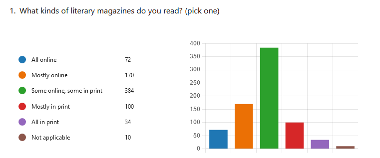
While most of you said you read some lit mags online and some in print (nearly half of the responses!), more of you read mostly or entirely online than read mostly or entirely in print (31 percent to 17 percent). Not surprisingly, when we compared these answers with overall age ratios of the respondents, those 55 and older were more likely to read print than online, and those 18-54 were the reverse. These results help us think about how we might increase online content, even as we stay committed to print.
(And an aside: throughout the survey, those who are older mentioned their concerns about ageism in the industry, so in addition to continuing the print magazine, we intend to delve into that issue in more depth, considering how we’re meeting the needs of our older writers and readers.)
You think our print magazine is about the right length—those of you who read it!
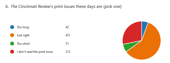
As you can see from the chart, the vast majority of respondents said the print magazine is a good length, with the next largest category (28%) being those who said they don’t read it. Only slim amounts of respondents thought the magazine was too long or too short. This tells us we’re in the right ballpark for what we’re doing with the print magazine—but we need to keep in mind that a quarter of our audience doesn’t read it!
Although most of you thought that our online content was sufficient for most reader’s needs and that the website design was all right, we got some helpful feedback as we think about redesign.
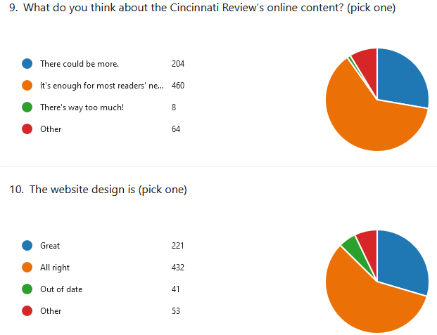
We looked closely through the “other” answers throughout the survey, and in those about the website, repeated themes stood out. Several of you suggested having more creative work visible on the homepage, compared to the blog posts such as interviews or mini–craft essays we highlight now, and others suggested more sample content from print issues.
In both of the questions pictured above, numerous responses criticized the design of the main page of our website, noting that it was cluttered and busy. Others of you noted rightly that the number and choice of colors go against the Web Content Accessibility Guidelines. We’re making accessibility a priority as we redesign the site, including a review from a professional in the field.
We were glad to hear that our monthly newsletter has been an effective communication technique.
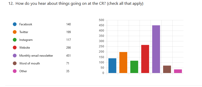
As the graph above shows, the largest source of CR news for respondents is the monthly newsletter that we started in spring 2021. We’re pleased to hear that’s been useful for you (and you can always hit the unsubscribe button at the bottom of the email if it’s not!). If you’re not already on the list, you can get added here, on our contact page (scroll down).
The next most popular source of information is the website itself, followed by Twitter, a mainstay of the writing community using social media. Respondents getting news from Facebook and Instagram fell after that, which doesn’t surprise us, based on the amounts of following/views we have there—and the Facebook algorithms that make it hard for our posts (as a Page) to be seen by our followers unless we pay for a boost.
We’ve been reading carefully through the rest of the survey answers as well, and we’re getting some great ideas that will help guide us in the future. Thanks again to those who took the time (an average of 8 minutes!) to give us their reactions, and congratulations to the survey raffle winners, who were contacted last week.