The Look of It: Visual Elements of Fiction
6 Minutes Read Time
I joined The Cincinnati Review’s team as a reader in fall 2025. While deeply invested in all the poetic noise of the written word, I was also interested in some of the less esoteric aspects of publishing. Specifically, the look and feel of a book on the shelf. What draws the reader’s eye? What makes a text into an object we can honor and hold? These are the questions that intrigued me. Lisa Ampleman, The Cincinnati Review’s managing editor, was kind enough to guide my exploration.
First, we investigated the nitty-gritty of printing. A book doesn’t end up on the shelf by accident. I had vocabulary to learn. I then had to consider the design choices in a book’s cover, the feel of the physical object in my hand, the cut of the paper, and the binding. Why does it matter that one cover feels silky to the touch with a gloss coat versus a matte coat? How does the choice between serif or sans serif fonts change the look of the page? How does the feel of the book as a physical object impact how the reader encounters the text within it?
A book isn’t just the words on the page. The page itself has a great deal to say. Here’s what I learned examining three books on my own shelf.
Between Two Fires by Christopher Buehlman (2012 edition)
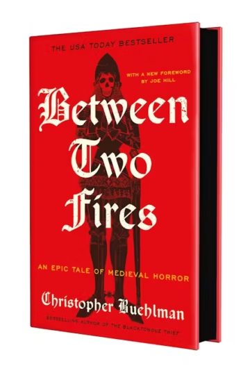
Between Two Fires has gone through several editions and reissues, though my version comes with a vivid red cover and was self-published by the author. The cover is matte and lettering is not offset. The cover has a varnish, smooth to the touch but not shiny. It has larger type font and perfect binding, with a trim size of 6 x 1.09 x 9 inches (U.S. trade). Interestingly, there is very little information in the frontmatter. The book only lists the table of contents, a dedication, and an acknowledgements section at the back. No author bio is included. I genuinely can’t remember another book that had as little front/back matter as this one does.
The red cover is quite striking with its imagery and general composition. The white lettering for the title and yellow subtitle lends the novel an elegant and creepy atmosphere, which reflects well on the content (medieval horror).
The Buffalo Hunter Hunter by Stephen Graham Jones (hardcover edition)
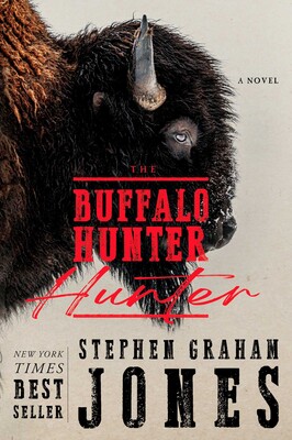
I’m lucky enough to have a signed edition after attending a release event at the Loft Literary Center in Minnesota. This version of the The Buffalo Hunter Hunter comes with an adhesive case wrap and dust jacket and stands at 6 x 1.09 x 9 inches (U.S. trade). It has perfect binding and no stitching. The letters on the cover and spine are offset and shiny. The interior designer is listed as Lewelin Polanco.
Interestingly, the edges of the pages are red, almost as if the manuscript itself is stained with blood—appropriate for a vampire novel. Further, The Buffalo Hunter Hunter uses two different fronts on the cover, likely because it’s an epistolary and follows two different forms of narration at two different points in history. One manuscript is handwritten and the second is typed in the modern area, which the cover choices are subtly preparing the reader for.
Overall, the design is bold and fun. I own a number of Stephen Graham Jones’ books and can confidently say this is the best looking one of the bunch.
My Sister, The Serial Killer by Oyinkan Braithwaite (hardcover)
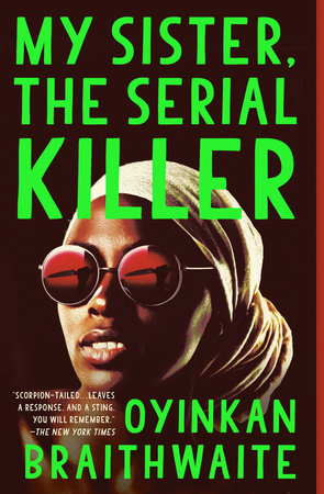
My copy of My Sister, The Serial Killer is slightly smaller than the other hardcovers on my shelf. The trim stands at 4.8 x 1 x 7.5 inches with an adhesive case wrap and dust jacket, as well as perfect binding. The jacket is shiny, unlike many of my other books. Jacket design is by Michael J. Windsor. When I worked at a bookstore, this is one of the novels I would recommend to people because it was so easy to pick out by sight on the shelves. Among all the mystery novels I own, this one stands out starkly.
The neon green lettering helps the novel in this regard. It’s rare for mysteries to use that color. At the time, it was the only one at the shop that size with that color lettering. You see it occasionally with horror novels but quite honestly, not a ton of genre books use that kind of neon green these days. A shame, in my opinion—it’s quite fun, visually. The cover design furthers this sense of fun. Oyinkan Braithwaite’s name looks like it has a blood splatter on it, except in green instead of the expected red. Having the text overlap Korede, the main character’s face, emphasizes the Killer part of the title. The reader can further see the reflection of the knife in her sunglasses, telegraphing what kind of story you’ll be getting.
The Woods All Black by Lee Mandelo (hardcover)
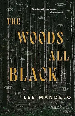
My version of The Woods All Black has a trim size of 5.65 x 0.65 x 8.75 inches, an adhesive case wrap and dust jacket and stitched binding. The cover was made by Christine Foltzer, Tor’s art director. The words are same texture/feel as the rest of the jacket. The title and blurb are serif, though the author’s name is in sans serif. This follows the format of Mandelo’s earlier novel, Summer Sons, which similarly had different fonts for the title and author name. Visual cohesion between the novels was clearly important.
A book isn’t just words tossed into the ether. The choices made around how to contain those words matter, too. The artistic intent stretches beyond the ephemeral. Nothing here was done thoughtlessly. It was meant to last.
So, what’s on your shelf? How did it get there? And what does it say to you about the words held there?